Introduction
December 26 2024: Images have been (mainly) reworked so that they make better use of the space in the tables and are aligned more consistently allowing an easier comparison of how UMAP and t-SNE differ. The t-SNE output is also improved. I also use more default settings. Plus more datasets.
December 29 2018 New, better settings for t-SNE, better plots and a couple of new datasets. Removed neighborhood preservation values until I’ve double checked they are working correctly.
Here are some examples of the output of uwot’s
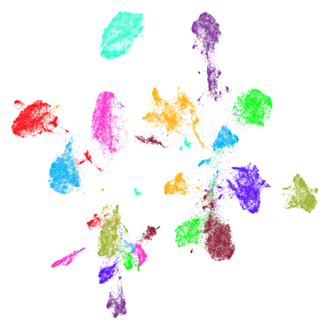
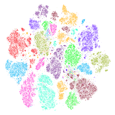
implementation of UMAP, compared to t-SNE output. As you will see,
UMAP’s output results in more compact, separated clusters compared to
t-SNE.
Data preparation
For details on the datasets, follow their links. Somewhat more detail
is also given in the smallvis
documentation. iris you already have if you are using
R. s1k is part of the sneer package.
frey, oli, mnist,
fashion, kuzushiji, norb and
cifar10 can be downloaded via snedata.
coil20 and coil100 can be fetched via coil20.
mnist <- snedata::download_mnist()

# For some functions we need to strip out non-numeric columns and convert data to matrix
x2m <- function(X) {
  if (!methods::is(X, "matrix")) {
    m <- as.matrix(X[, which(vapply(X, is.numeric, logical(1)))])
  }
  else {
    m <- X
  }
  m
}
At the time I generated this document (late December 2018), the
kuzushiji dataset had some duplicate and all-black images
that needed filtering. This seems to have been remedied as of early
February 2019. I re-ran both UMAP and t-SNE on the fixed dataset, but
the results weren’t noticeably different. For the record, the clean-up
routines I ran were:
# Remove all-black images in Kuzushiji MNIST (https://github.com/rois-codh/kmnist/issues/1)
kuzushiji <- kuzushiji[-which(apply(x2m(kuzushiji), 1, sum) == 0), ]
# Remove duplicate images (https://github.com/rois-codh/kmnist/issues/5)
kuzushiji <- kuzushiji[-which(duplicated(x2m(kuzushiji))), ]
Settings
For UMAP I used default settings with the umap2 function
with one exception: I have the pre-calculated exact nearest neighbors
for these datasets to hand, so I used those rather than approximate
nearest neighbors. For more on umap2 see the umap2
article.
For t-SNE, I used the Python package openTSNE (version 1.0.2) with its default settings.
Visualization
For visualization, I used the vizier package.
s1k
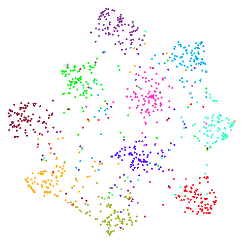
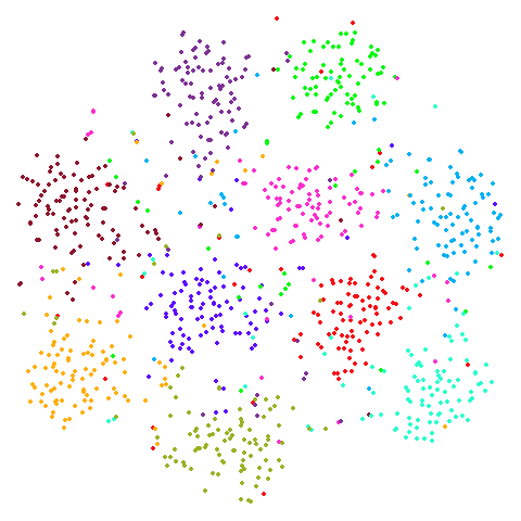
A 9-dimensional fuzzy simplex, which I created for testing t-SNE and related methods, original in the sneer package.
| UMAP | t-SNE |
|---|---|
 |
 |
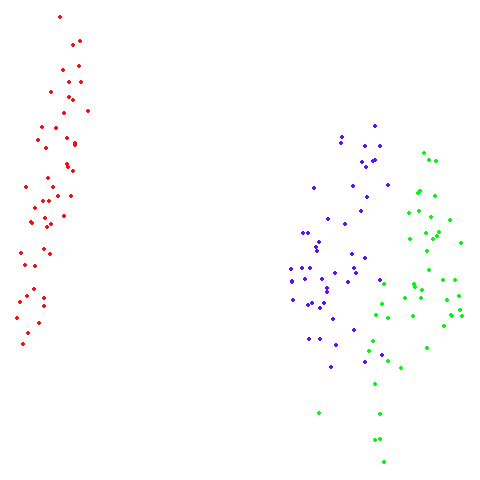
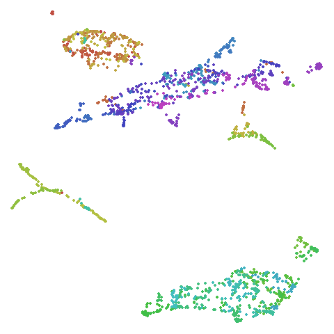
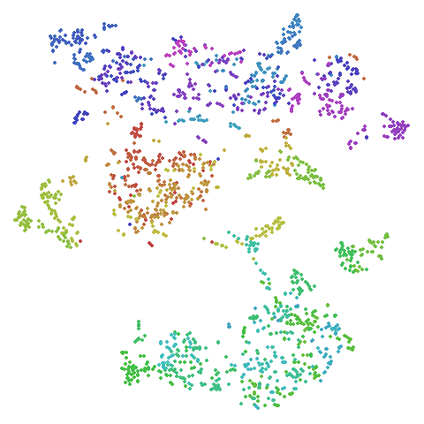
frey
Images of Brendan Frey’s face, as far as I know originating from a page belonging to Saul Roweis.
| UMAP | t-SNE |
|---|---|
 |
 |
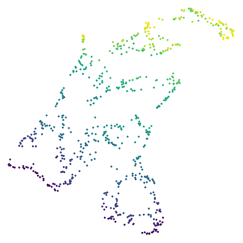
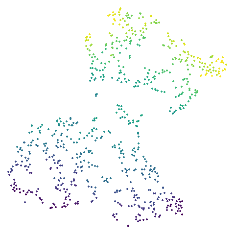
isofaces
Yet more faces, this time the dataset used in Isomap, consisting of images of the same face under different rotations and lighting conditions. Unfortunately, it’s no longer available at the MIT website, but it can be found via the Wayback Machine. I wrote a gist for processing the data in R.
In the images below the points are colored by the left-to-right pose angle.
| UMAP | t-SNE |
|---|---|
 |
 |
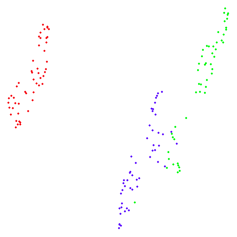
swiss roll (isoswiss)
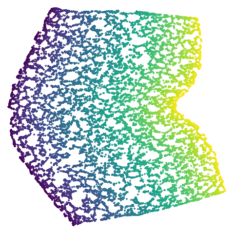
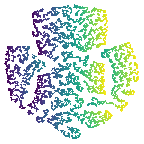
The Swiss Roll data used in Isomap. A famous dataset, but perhaps not that representative of typical real world datasets. t-SNE is known to not handle this well, but UMAP makes an impressive go at unfolding it.
| UMAP | t-SNE |
|---|---|
 |
 |
norb
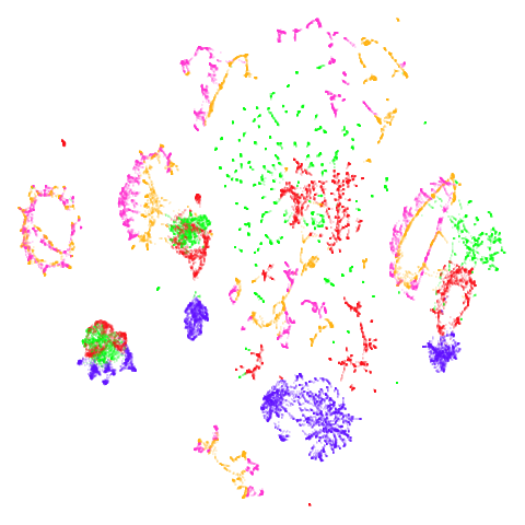
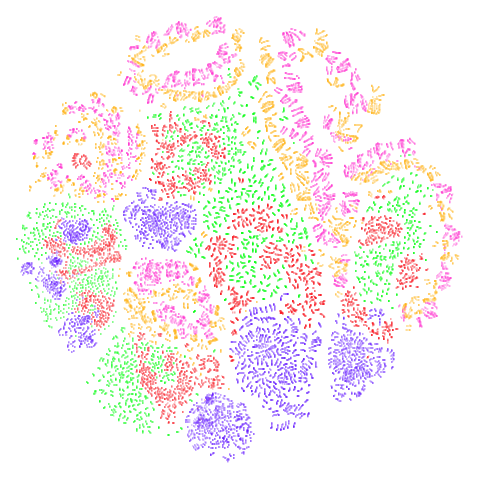
The small NORB dataset, pairs of images of 50 toys photographed at different angles and under different lighting conditions.
| UMAP | t-SNE |
|---|---|
 |
 |
cifar10
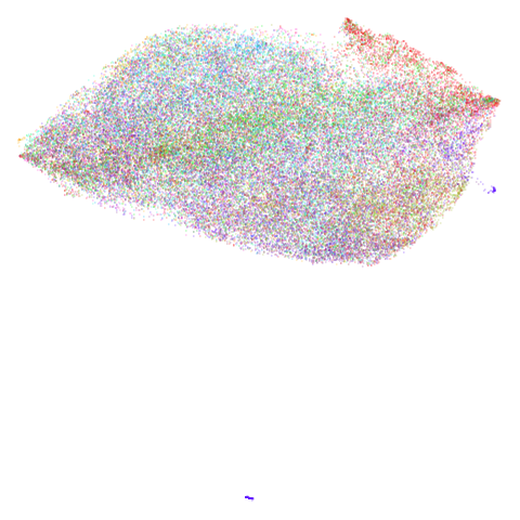
The CIFAR-10 dataset, consisting of 60000 32 x 32 color images evenly divided across 10 classes (e.g. airplane, cat, truck, bird). t-SNE was applied to CIFAR-10 in the Barnes-Hut t-SNE paper, but in the main paper, only the results after passing through a convolutional neural network were published. t-SNE on the original pixel data was only given in the supplementary information (PDF) which is oddly hard to find a link to via JMLR or the article itself, and in the less widely-cited preliminary investigation into BH t-SNE.
| UMAP | t-SNE |
|---|---|
 |
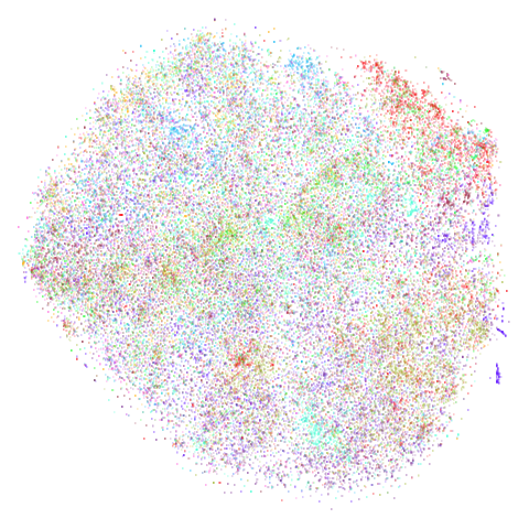 |
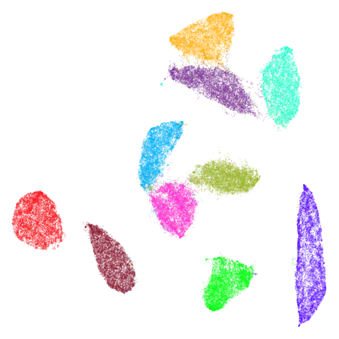
There is an outlying purple cluster (which isn’t easy to see) in the
center bottom of the UMAP plot. I see the same thing in the Python
implementation, so I don’t think this is a bug in uwot
(although I also said that in a previous version of this page, and it
turned out there was a bug in uwot. The current
result really is closer to the Python version now, though). That cluster
of images is of some automobiles but they all seem to be variations of
the same image. The same cluster is present in the t-SNE plot (bottom
left), but is more comfortably close to the rest of the data.
The existence of these near-duplicates in CIFAR-10 doesn’t seem to have been widely known or appreciated until quite recently, see for instance this twitter thread and this paper by Recht and co-workers. Such manipulations are in line with the practice of data augmentation that is popular in deep learning, but you would need to be aware of it to avoid the test set results being contaminated. These images seem like a good argument for applying UMAP or t-SNE to your dataset as a way to spot this sort of thing.
As the visualization of CIFAR-10 isn’t very successful with UMAP or
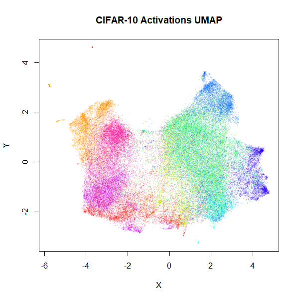
t-SNE, here are some results using the activations of a convnet, similar
to that used in the BH t-SNE paper. For the convnet, I used a keras implementation, taken from the Machine
Learning in Action blog. Features were Z-scaled as carried out in
the blog, but I used 100 epochs and a batch size of 128 and I also used
the RMSprop
(PDF) optimizer favored in the Deep
Learning with Python book (with lr=1e-4 and
decay=1e-6). Without any data augmentation, this gave a
test set error of 0.1655, slightly lower than the test set
result given in the BH t-SNE paper (which used a different architecture
and without the benefit of an extra 4 years of deep learning research).
After retraining with all 60000 images, the flattened output of the
final max-pool layer was used, giving 2048 features (the BH t-SNE paper
network had 1024 output activations). UMAP and t-SNE results are below.
For the UMAP results, I used the t-UMAP settings with scaled PCA
initialization.
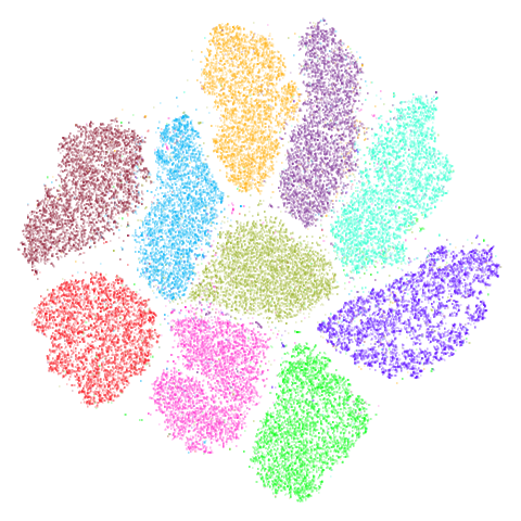
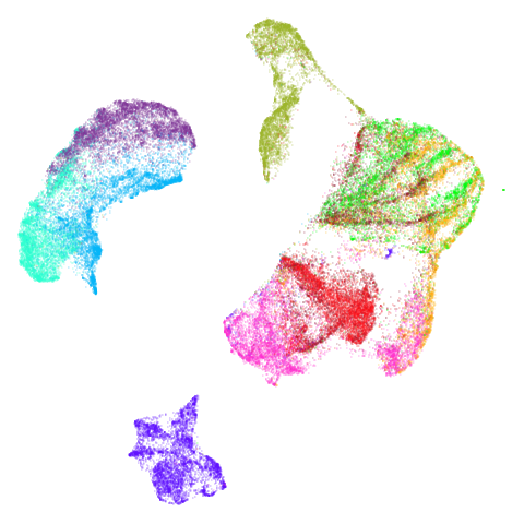
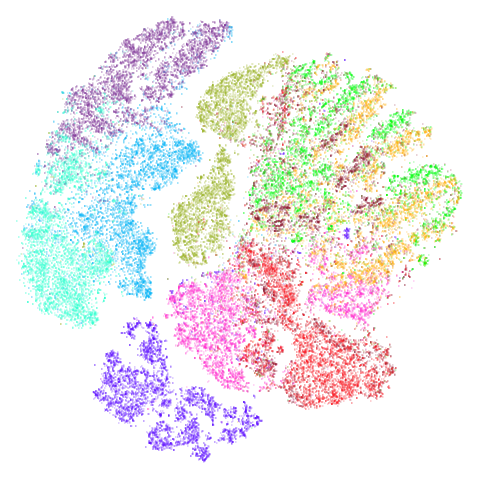
 |
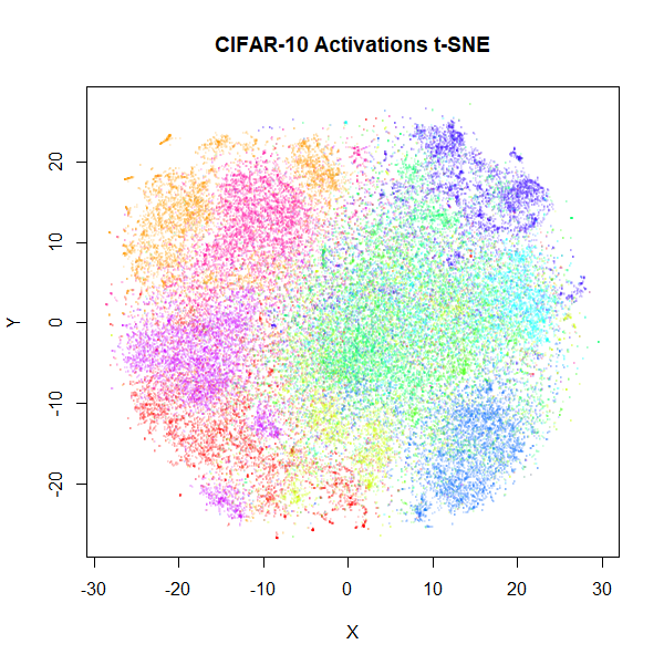 |
Results don’t look quite as good as those in the BH t-SNE paper, but they are still an improvement. The orange cluster of automobiles remains as an outlier, even in the activation space. You can also see it in the BH t-SNE paper in the lower image in Figure 5 (orange cluster at the bottom, slightly left of center).
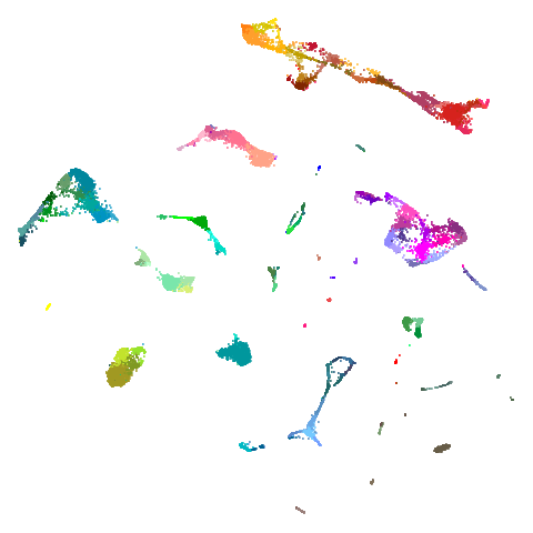
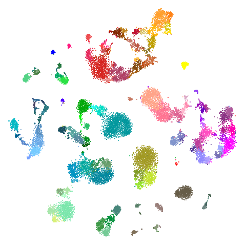
tasic2018
The tasic2018 dataset is a transcriptomics dataset of
mouse brain cell RNA-seq data from the Allen Brain Atlas
(originally reported by Tasic and
co-workers. There is gene expression data for 14,249 cells from the
primary visual cortex, and 9,573 cells from the anterior lateral motor
cortex to give a dataset of size n = 23,822 overall. Expression data for
45,768 genes were obtained in the original data, but the dataset used
here follows the pre-processing treatment of Kobak and Berens which applied
a normalization and log transformation and then only kept the top 3000
most variable genes.
The data can be generated from the Allen Brain Atlas website and processed in Python by following the instructions in this Berens lab notebook. I output the data to CSV format for reading into R and assembling into a data frame with the following extra exporting code:
np.savetxt("path/to/allen-visp-alm/tasic2018-log3k.csv", logCPM, delimiter=",")
np.savetxt("path/to/allen-visp-alm/tasic2018-areas.csv", tasic2018.areas, delimiter=",", fmt = "%d")
np.savetxt("path/to/allen-visp-alm/tasic2018-genes.csv", tasic2018.genes[selectedGenes], delimiter=",", fmt='%s')
np.savetxt("path/to/allen-visp-alm/tasic2018-clusters.csv", tasic2018.clusters, delimiter=",", fmt='%d')
np.savetxt("path/to/allen-visp-alm/tasic2018-cluster-names.csv", tasic2018.clusterNames, delimiter=",", fmt='%s')
np.savetxt("path/to/allen-visp-alm/tasic2018-cluster-colors.csv", tasic2018.clusterColors, delimiter=",", fmt='%s')| UMAP | t-SNE |
|---|---|
 |
 |
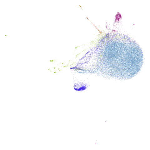
macosko2015
Another transcriptomics data set, used as an example in openTSNE. This contains data for 44,808 cells from the mouse retina.
The raw data was fetched similarly to this shell
script from the Hemberg Lab and then the data was prepared using the
openTSNE
notebook by Pavlin Policar. Similarly to the tasic2018
dataset, data was log normalized and the 3,000 most variable genes were
retained.
I exported the data (without the Z-scaling and PCA dimensionality reduction), as a CSV file, e.g.:
np.savetxt("/path/to/macosko2015/macosko2015-log3k.csv", x, delimiter=",")
# Use these as column names
np.savetxt("/path/to/macosko2015/macosko2015-genenames.csv", data.T.columns.values[gene_mask].astype(str), delimiter=",", fmt = "%s")
np.savetxt("/path/to/macosko2015/macosko2015-clusterids.csv", cluster_ids.values.astype(int), delimiter=",", fmt = "%d")| UMAP | t-SNE |
|---|---|
 |
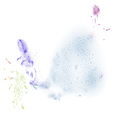 |
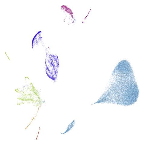
Results are not that impressive looking (especially for UMAP). I include this example because it’s very common in scRNA-seq packages to apply PCA to the gene expression data before UMAP. In this case, I have reduced the dimensionality down to 100. After that transformation, results look very different (with much better separation of clusters):
| UMAP | t-SNE |
|---|---|
 |
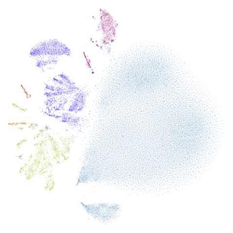 |
The good news is that results look better and the nearest neighbor search step in both t-SNE and UMAP will go faster, which is often why this is carried out. The bad news is that you now have to justify the biological basis for the PCA pre-processing, which has clearly changed the relationship between the different measurements. And why 100 dimensions?
In most datasets I’ve seen PCA pre-processing doesn’t have such a noticeable effect, which is why I like this dataset.
S-curve With a Hole (scurvehole)
Used by the dimensionality reduction method PaCMAP. It is generated
by the script at https://github.com/YingfanWang/PaCMAP/blob/master/experiments/run_experiments.py.
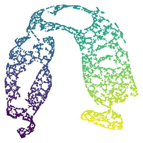
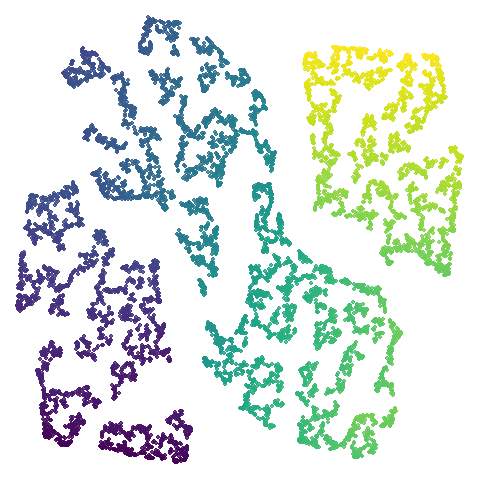
script mentioned It’s an S-curve with a hole in the middle, and so
should be amenable to being unfolded into 2D. Similar to
isowiss.
| UMAP | t-SNE |
|---|---|
 |
 |
mammoth
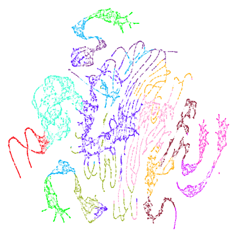
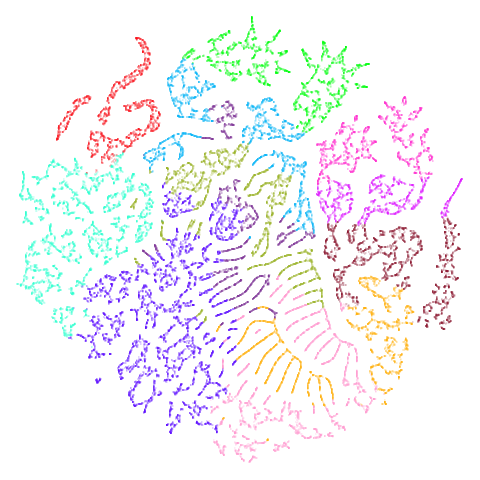
A 3D point cloud of a mammoth at the Smithsonian. A 50,000 point sample was used used in Understanding UMAP and is available for download from the github repo. There is also a 10,000 point sample available in the same repo, but I use the 50,000 point version.
As far as I can tell, it was first used for dimensionality reduction
by Max Noichl at https://github.com/MNoichl/UMAP-examples-mammoth-/blob/9e82eb3ee5b99020d74e99d2060856d49e8b9f85/umammoth.ipynb.
Following the example in that notebook, the colors in this dataset were
generated by assigning 12 clusters to the 3D data via the Agglomerative
Clustering method in sklearn.
mammoth is highly associated (at least in my mind) with
the PaCMAP method.
The [PaCMAP paper](paper makes
extensive use of it.
| UMAP | t-SNE |
|---|---|
 |
 |
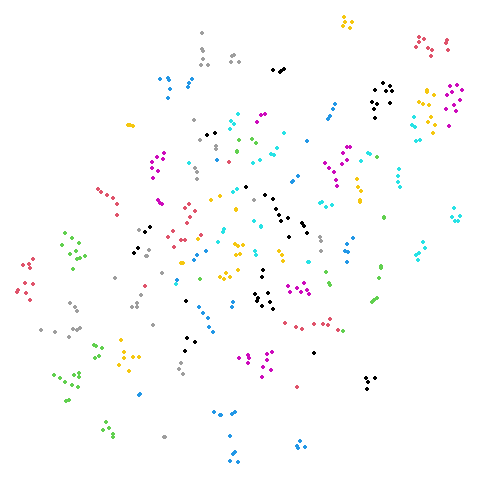
hierarchical
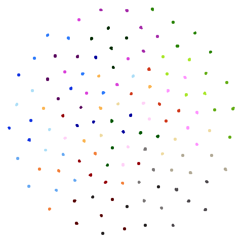
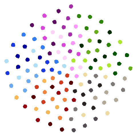
Another dataset used in the PaCMAP paper, but for which I was unable to find the code to generate it in the PaCMAP repo. The paper describes it thusly: ’consists of 5 “macro clusters” that each have 5 “meso clusters,” and each of the meso subclusters has 5 “micro clusters.” Thus, there are 5x5x5 = 125 micro clusters total. We colored each point based on its true macro clusters, shading each meso cluster.”. Get all of that? There’s more detail in Appendix B of the paper and I think I was able to turn that into some Python that probably generated the correct data. I think it’s correct. For more details see https://github.com/jlmelville/drnb/blob/master/notebooks/data-pipeline/synthetic-hierarchical.ipynb. I have not yet summoned the enthusiasm to come up with a pure R version.
| UMAP | t-SNE |
|---|---|
 |
 |
spheres
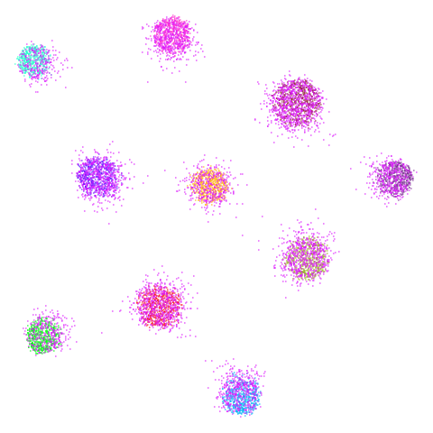
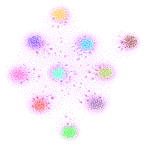
A dataset from the topological autoencoders paper. Another synthetic hierarchical dataset, with 10 high-dimensional spheres embedded in a larger sphere. Most dimensionality reduction methods that focus on local measures like nearest neighbors have trouble with these sorts of datasets, where representing the global structure and scale is challenging.
| UMAP | t-SNE |
|---|---|
 |
 |
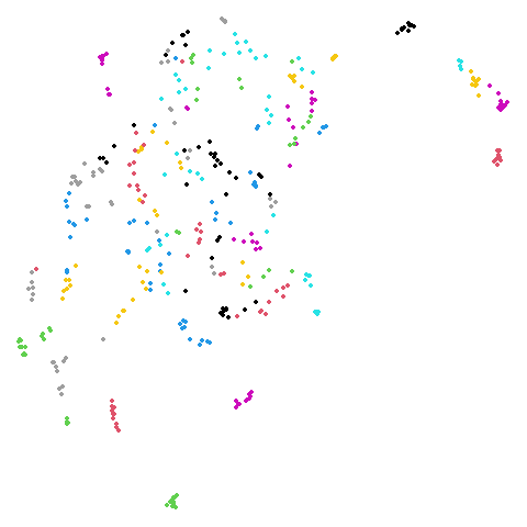
20 Newsgroups (ng20)
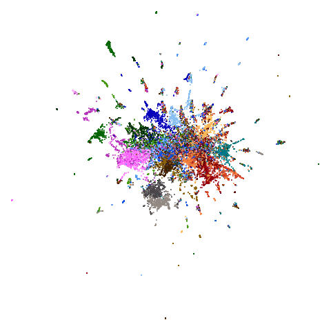
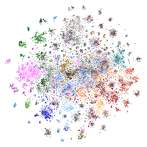
The 20 Newsgroups dataset, containing a sample of Usenet posts (ask your parents or maybe grandparents at this point) from 20 different newsgroups. For more details see the Sparse Data Article.
I refer to this as ng20 a lot due to being unable to
begin any variables with a number.
As many dimensionality reduction methods are unable to handle sparse
data, I also sometimes use the dense version of this dataset,
ng20pacmap which can be found in numpy format at the PaCMAP
repo at https://github.com/YingfanWang/PaCMAP/tree/master/data
as 20NG.npy (i.e. in numpy format). Labels are also
available there at 20NG_labels.npy If I had to guess I
would say that the initial data was subjected to TF-IDF followed by PCA
down to 100 dimensions to convert it from sparse to dense format, but I
don’t know for sure, nor do I know what pre-processing or normalization
was carried out.
The image below is for ng20pacmap.
| UMAP | t-SNE |
|---|---|
 |
 |
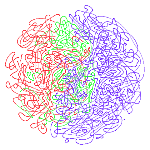
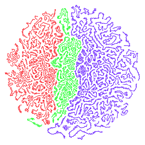
Tomoradar
Used in the related papers T-SNE Is Not Optimized to Reveal
Clusters in Data and Stochastic Cluster Embedding
and originally from UAV-Borne Profiling Radar
for Forest Research. A link to the data can be found via the SCE repo. This is a dataset
of microwave radar data from forest canopy. This is a large dataset in
terms of number of items (~120,000) and number of features (~8,000).
This makes it a pain to process, and neither UMAP nor t-SNE do a good
job of separating out the three main classes, but both uwot
and the Python UMAP package take a surprisingly long time to carry out
the spectral initialization, so this could be a good example dataset
when timing and evaluating initialization methods.
| UMAP | t-SNE |
|---|---|
 |
 |
