PaCMAP Comparison
Making UMAP behave (more) like PaCMAP
Source:vignettes/articles/pacmap-comparison.Rmd
pacmap-comparison.RmdIntroduction
PaCMAP (paper, repo) is a highly-regarded dimensionality method, firmly in the LargeVis/UMAP family. It’s main point of differentiation from related methods is that it balances local and global structure without needing to tune hyperparameters. The PaCMAP authors’ blog post explicitly states:
PaCMAP has no parameters that are designed to be tuned.
Bold words! Also PaCMAP is pretty fast.
Alas there is no native R package for PaCMAP (as far as I know). You
can of course call it via reticulate, and the PaCMAP repo
has a notebook
demonstrating that. But that’s a bit unsatisfactory. I have spent a lot
of time studying the Python code and you can see my notes on the
method if you want the details. The upshot of all that is that I
feel qualified to say that it would actually be quite hard to integrate
PaCMAP into uwot.
Turning UMAP into PaCMAP?
But can we bend UMAP to make it behave more like PaCMAP? Here is a very high-level overview of the most important ways that PaCMAP differs from UMAP:
- Nearest neighbors are chosen using a method originating in self-tuning spectral clustering and also used in Trimap. This rescales some nearest neighbor distances based on local densities. This doesn’t seem to make a massive difference in results in my testing so I won’t worry about implementing it.
- There is a special class of “mid-near” items, which are points
further away than nearest neighbors but closer than randomly-sampled
pairs. In the language of contrastive learning, you can think of these
as “semi-positive” examples. Use of these mid-near pairs requires
introducing a new loss term and gradient type, which is the main problem
with integrating PaCMAP into
uwot. Plus there are different weights applied to each component of the loss which changes during the optimization process. This would require even more reworking ofuwot. Fortunately, it seems like most of the benefit of this (and using mid-near items in general) is when you initialize the embedding randomly. Let’s just not do that. - The negative examples for each item are are sampled once and then re-used for all epochs, unlike UMAP which is always selecting different vertices. We’re also not going to do this as this is probably just a speed optimization rather than necessary for the working of the method as a whole.
- By default, if your input data has more than 100 columns, then
Truncated SVD is applied to reduce the dimensionality to 100. I’m not
really a fan of this as a default setting, but we can easily implement
it by setting
pca = 100. It does seem to be an important part of PaCMAP’s speed improvements too. - Initialization is with PCA, which is also easily implemented in
uwotwithinit = "pca". PaCMAP then shrinks this by multiplying all the coordinates by0.01. This is supported by settinginit = "pacpca"if you really want to do it, but I don’t think it’s necessary (or actually that good an idea). - The loss function and gradient for PaCMAP are rather different from UMAP. In general these are more gentle than UMAP’s and cause less tearing and twisting of any manifold structure in the embedded coordinates. But in most real-world datasets I have looked at, there isn’t a huge effect from the gradient.
So from all of the above you can see that there are some reasonable changes between UMAP and PaCMAP and most of my responses have been “yeah, I don’t fancy changing that”. So to put my cards on the table, I think the major source of differences between UMAP and PaCMAP are:
- Using PCA as initialization (this is the most important difference).
- Using PCA to reduce high-dimensional data to 100 dimensions.
Methods
To make this simple I used:
- PaCMAP with its default settings. I used Python 3.12 and PaCMAP 0.7.3. There have been some patch releases since then, but it has no meaningful effect on the results shown here.
- For UMAP, I used default
umap2parameters. HNSW was used as the nearest neighbor method.
I didn’t make any effort to match number of neighbors or number of epochs and so on. I think these are all pretty comparable with their default settings.
PCA was performed using irlba. To make results easier to
compare, the output coordinates were rigid-body rotated to align with
the PCA results using the Kabsch algorithm (the coordinates were also
additionally flipped along one dimension, and the result with lowest
error was chosen).
Datasets
I tried to use a variety of datasets, including many used by the PaCMAP authors in their paper and blog-post. Many of these had Python code in the PaCMAP repo which was very useful. See the examples article for more details on the datasets.
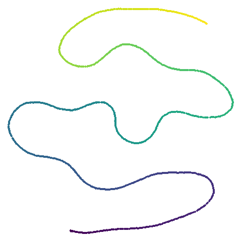
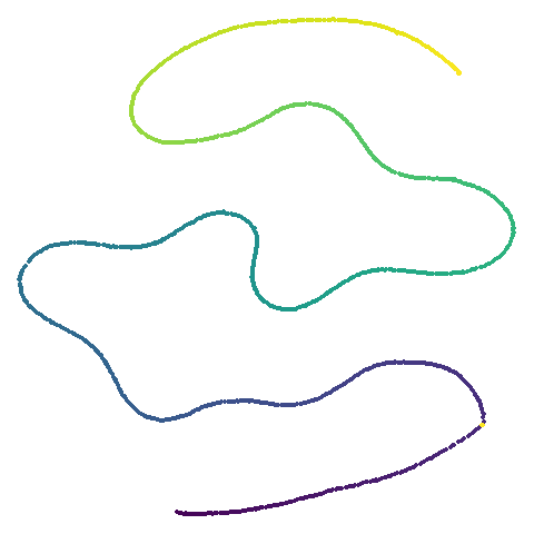
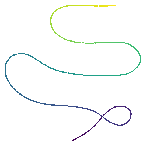
One extra dataset that we will also look at is curve2d,
a simple 2D curve. This is used as an example in the paper of how even
if you start with the original coordinates scaled by a constant,
dimensionality reduction methods will, rather than do nothing, still
distort the overall shape. Python code to generate the curve is at https://github.com/YingfanWang/PaCMAP/blob/master/experiments/run_experiments.py.
Results
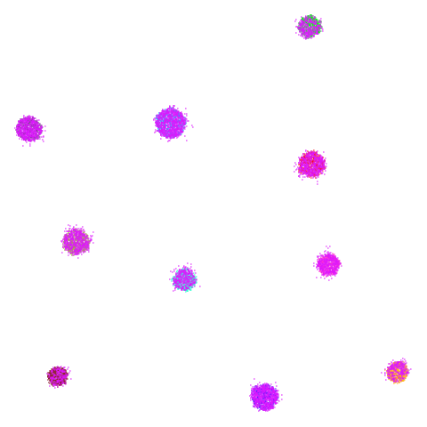
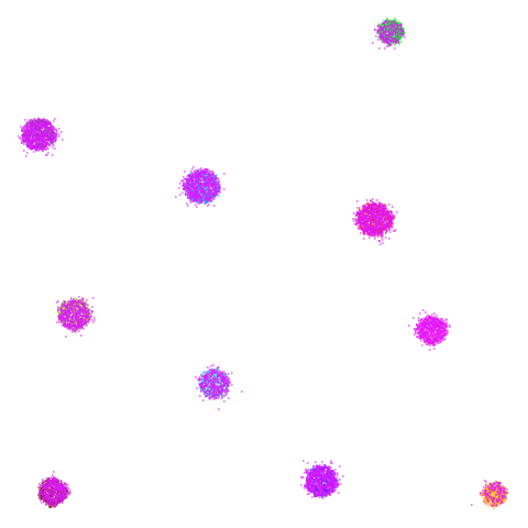
There’s a table of embeddings below. ased on my feelings that PCA is the key to a lot of PaCMAP’s differences to UMAP, I have three different settings of UMAP. From left to right the settings used were:
- UMAP with its default parameters (
UMAP). - UMAP initialized with PCA (
UMAP PCA), i.e.init = "pca". - UMAP with the input data reduced to 100 dimensions via PCA, if it
had more than 100 columns (
UMAP-PCA100) and also initialized with PCA, i.e.init = "pca", pca = 100.
Finally on the right are the embeddings from running PaCMAP.
I made no special effort to account for variability between runs for either UMAP or PaCMAP. Based on having run these many, many times, I am confident that the results are representative of the methods’ performance.
If you have javascript enabled, you can click on any image to embiggen it.
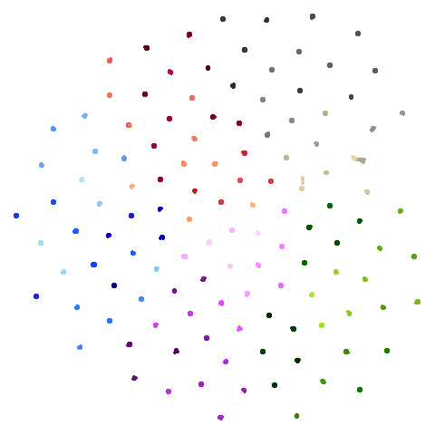
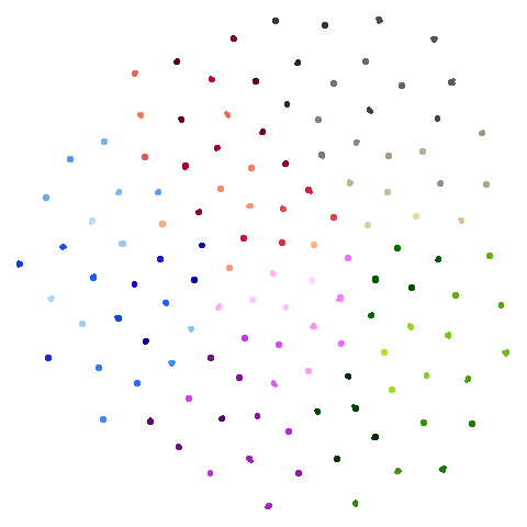
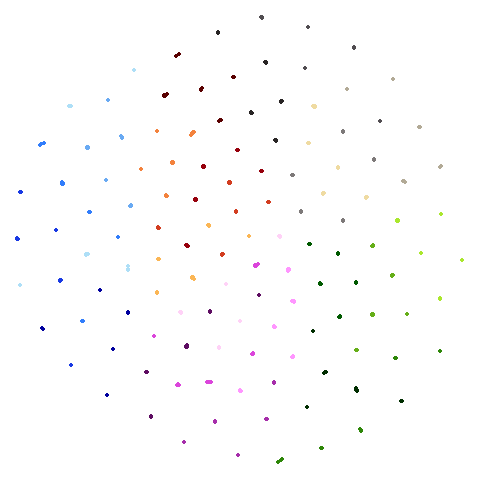
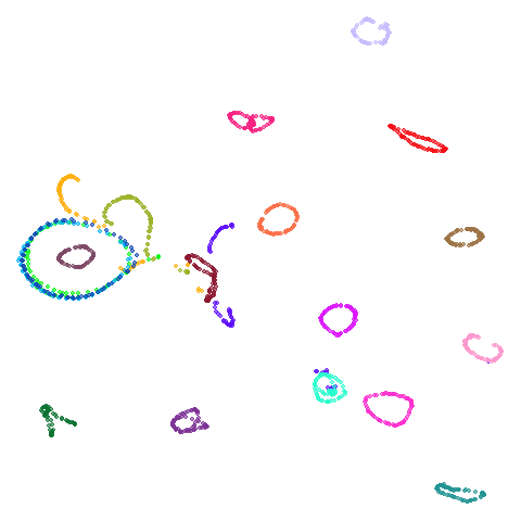
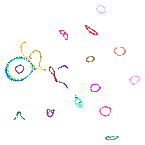
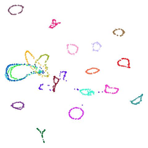
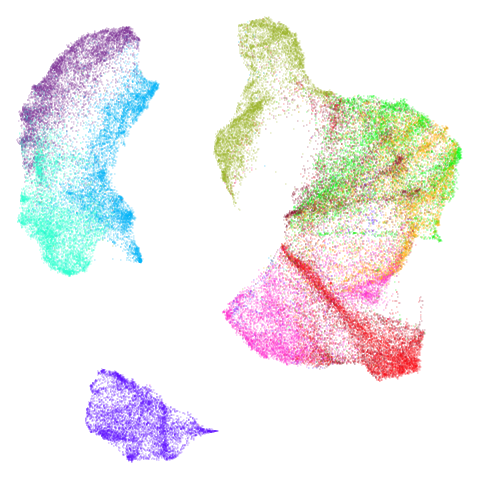
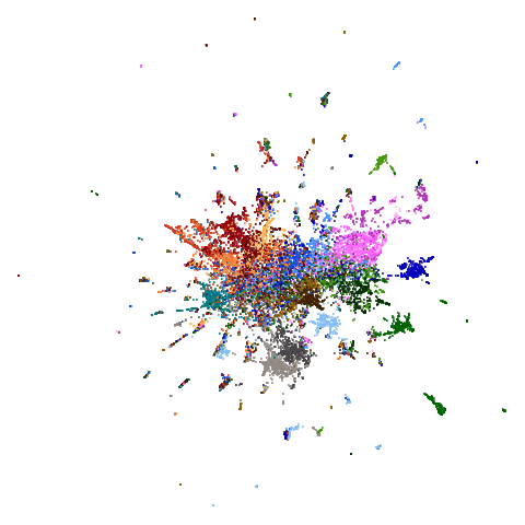
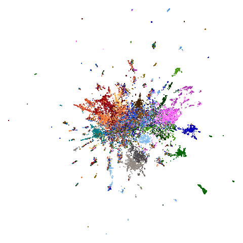
| Dataset | UMAP | UMAP PCA | UMAP PCA100 | PaCMAP |
|---|---|---|---|---|
| curve2d | 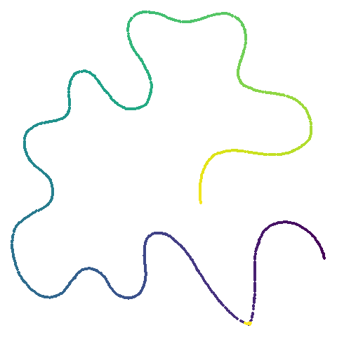 |
 |
 |
 |
| mammoth | 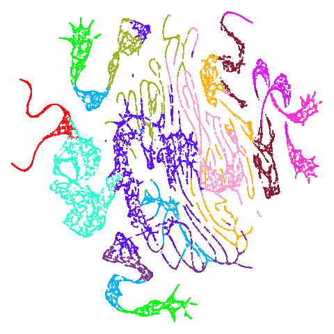 |
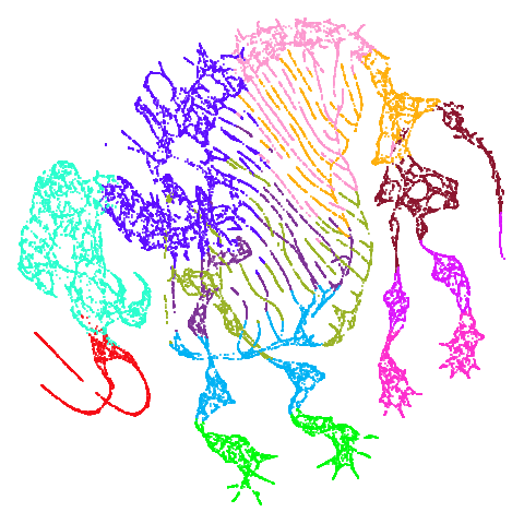 |
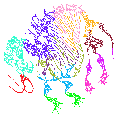 |
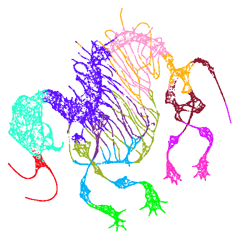 |
| scurvehole | 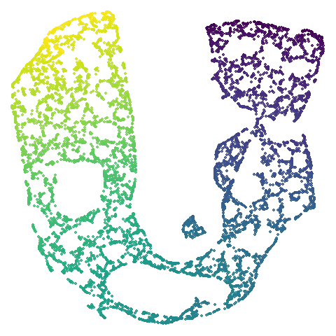 |
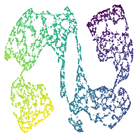 |
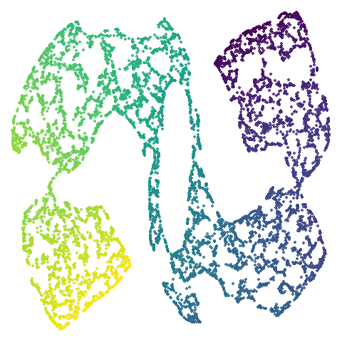 |
 |
| isoswiss | 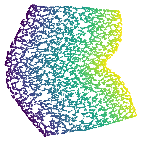 |
 |
 |
 |
| hierarchical | 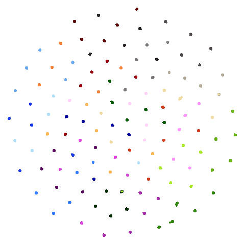 |
 |
 |
 |
| spheres | 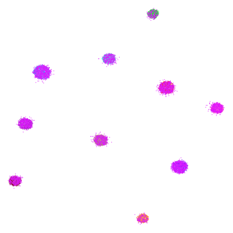 |
 |
 |
 |
| coil20 | 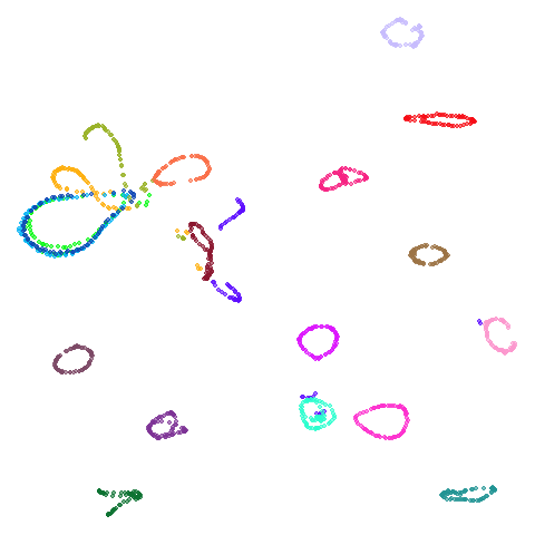 |
 |
 |
 |
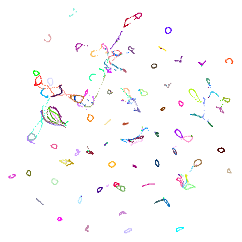
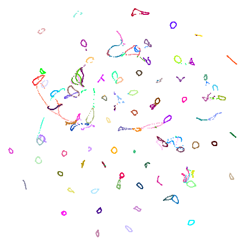
| coil100 | 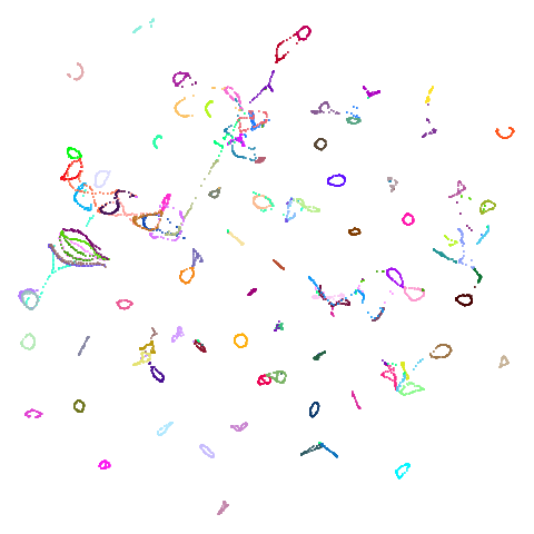 |
 |
 |
 |
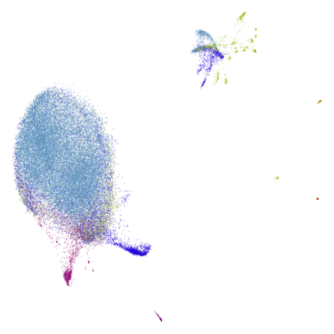
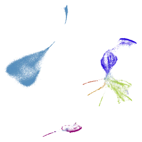
| macosko2015 | 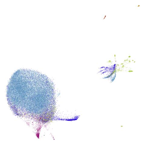 |
 |
 |
 |
| mnist | 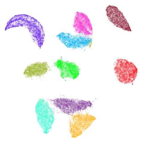 |
 |
 |
 |
| fashion |  |
 |
 |
 |
| ng20pacmap | 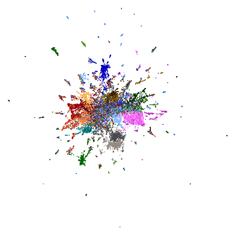 |
 |
 |
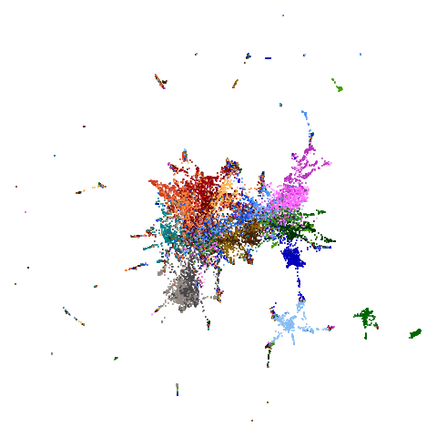 |
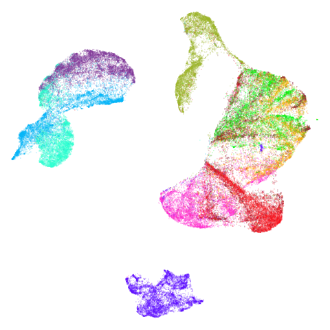
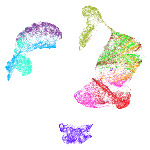
Headline results from my point of view are that going from left to right, UMAP results get more like PaCMAP. But in many cases the default UMAP results don’t seem that different to the PaCMAP results. In a lot of these datasets, where there are differences, they have already been discussed at length in the PaCMAP paper, but in act of enormous ego I will provide my own commentary, you lucky things.
UMAP certainly makescurve2d a lot twistier than PaCMAP.
And mammoth looks very different. It’s been brutally
spatchcocked by UMAP, but it’s not been ripped to shreds. However, it’s
undeniable that the human eye definitely perceives the side-on view that
PaCMAP provides as being more “natural”. Also scurvehole
demonstrates that UMAP has a tendency to rip low-dimensional manifolds
more than PaCMAP. That said this dataset does often get ripped by PaCMAP
too (both the ends and – less often – the area around the hold can be
ripped), although the degree of ripping is not as pronounced as for
UMAP.
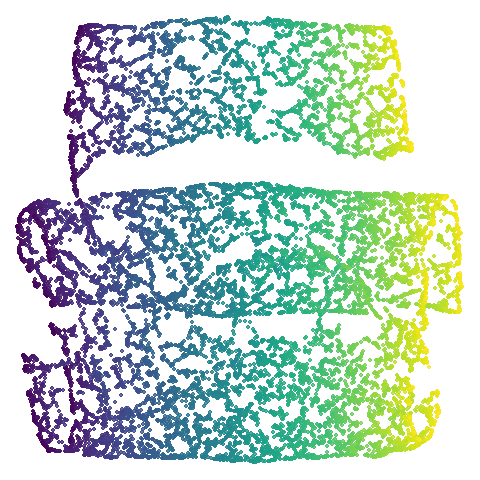
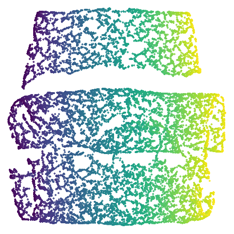
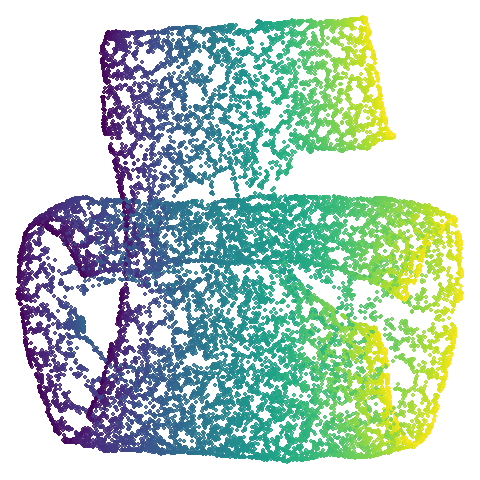
Let’s also look at isoswiss. Here UMAP is
better than PaCMAP and does a good job at nearly unfolding it.
It’s a bit hard to see what PaCMAP has done here, but it’s undone by the
PCA initialization which keeps the data rolled up. There has been some
unrolling, but it’s tough to ask a method that works on iteratively
updating pairs of points to do the large scale rearrangement of
unfolding, and instead the top part of the embedding has been
ripped.
You can see the same thing happening to a lesser extent with
scurvehole where the two ends are a bit twisted. This is
the same issue with a PCA initialization not being local enough. Is it
the end of the world? No. It’s just a bit of a shame we have to
sacrifice unfolding of these manifold examples given that the “M” in
PaCMAP also stands for “manifold”.
But these are all low-dimensional datasets. I would love to see methods that could adapt to the intrinsic dimensionality of the data they are working on, and PaCMAP’s gentler approach is definitely superior here. But I am not sure that these are representative of the kind of data that people are actually working with. And whether there are lots of nice low-dimensional manifolds out there waiting to be unfolded is an open question. If not, then PCA is a good enough initialization for most datasets.
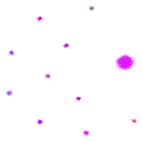
I’ll also briefly note something a bit odd about
spheres. Neither UMAP nor PaCMAP do a good job at
recognizing that the ten clusters are embedded in a larger sphere.
Perhaps not surprising due to the local nature of these methods. But
while UMAP gives a result with ten clusters, representing the ten
spheres, plus the points from the other cluster that were most local to
them, PaCMAP has eleven clusters. There is a large blob off to
the side that seems to be just the background cluster. Interesting, and
maybe you might like this result better due to it detecting the other
sphere, even if the “containment” relationship hasn’t been preserved.
However, I have seen artifactual behavior with Annoy sometimes when
there are lots of degenerate distances and the parameters haven’t been
set correctly. So there is a possibility that this is an artifact of the
nearest neighbor method having some issues. That would be something to
rule out but I haven’t done that here.
coil100 is an interesting case and is why I think the
“multiply the PCA coordinates by 0.01” approach of PaCMAP may give
slightly inconsistent initialization on occasion. UMAP gives a
circular-looking result, whereas PaCMAP is more elongated, with some of
the circular structures noticeably above or to the right of the body of
the embedding. This is a case where the PaCMAP result is very influenced
by the PCA initialization: the overall extent of the initialization is
quite a large value: the side length of the bounding box of the
initialized coordinates is around ~200 units vs ~30 for the PCA
initialization of mnist. This leads to large interpoint
distances which is the enemy of all SNE-like methods: the gradients are
smaller than usual and hence more of the initial structure is kept. This
could be seen as a good thing, because you might want to keep more of
the PCA-inspired layout and focus more on local optimization. However,
it’s not something that happens consistently with PaCMAP, it really
depends on the initial scaling of the input dataset. Having a better
scaling of the input coordinates would help here, such as the UMAP
approach of scaling the coordinates to a cube of length 10.
Of the other datasets, the one that stands out as most different
between UMAP and PaCMAP to my eyes is macosko2015. The
PaCMAP result looks much nicer here. I like this dataset because results
are very affected by PCA.
Now let’s see what using PCA initialization does to UMAP. The obvious
place to look is at mammoth and here we see that the
results are now much closer to PaCMAP’s. The same is true for
curve2d and isoswiss. scurvehole
also has an overall layout much closer to PaCMAP, but the degree of
twisting and ripping is definitely worse for UMAP.
Elsewhere, things aren’t changed so much. I admit I am a bit annoyed
by the result for coil20 where one ring on the left is now
stuck inside a larger ring which isn’t the case for the spectral
initialization of PaCMAP but I will get over it. The UMAP + PCA result
for coil100 also has the same circular shape as with the
spectral initialization rather than the elongated shape of the PaCMAP
result which I argue is further evidence that more control over the
initial scaling of PaCMAP could be helpful.
I also would say that in terms of overall layout, whether the
mnist cluster layout for UMAP or UMAP+PCA is more like the
PaCMAP result is a bit of a toss-up. But how well these methods work on
mnist is the last thing anyone should worry about. That
really leaves macosko2015 whch still bears little
resemblance to the PaCMAP result.
In the third column we use PCA to reduce the initial dimensionality
of the data to 100 and we use the first two principal
components as the initial coordinates. This will only give a difference
in results compared to the UMAP+PCA results if the input data has more
than 100 columns, which is not the case for most of the datasets at the
top of the table. Further down not much happens except for
macosko2015, which now looks much more like the PaCMAP
results. This was not terribly surprising to me because I know that this
dataset is highly affected by running PCA on it first.
Conclusions
If you want a more PaCMAP-like experience out of uwot
using pca = 100, init = "pca" is a good way to go. Even for
lower-dimensional synthetic data, PCA will give you results closer to
PaCMAP, although they may look a bit more raggedy.
What about random initialization?
One of PaCMAP’s selling points is that you will get more consistent results even if you don’t use PCA for initialization. I will grant you that this is certainly a point in PaCMAP’s favor. But on the other hand, there’s a limited number of circumstances where you can’t just use PCA for initialization. The PaCMAP paper doesn’t go into detail about what these circumstances are, so I will just give you some of my ideas. The main one might be that you have data which doesn’t really lend itself to PCA. Probably binary data is the most obvious case here, although PaCMAP only supports the Hamming distance for binary data so your options are a bit limited anyway. Another example might be where the data is such that you have access to the k-nearest neighbors but not the underlying ambient data. But in that case, you would not be able to generate the mid-near pairs needed for PaCMAP’s performance so you would be out of luck anyway.
However, I am sure other scenarios exist. In those cases, PaCMAP is a
good choice. For other cases we can make UMAP do what we want in
uwot easily enough.
Ok, but will it be as fast?
The bottleneck for most of these methods is the speed of the nearest
neighbor search which is in turn dependent on the input dimensionality.
So if the PCA process is sufficiently fast then the overall speed of the
PaCMAP approach will outperform the UMAP approach. In uwot
I find that irlba tends to be a bit slower than the
truncated SVD available in sklearn in Python as used by
PaCMAP but it depends on the linear algebra library on your system.
Due to some other internal differences, I would still anticipate that
PaCMAP will be a bit faster than UMAP under these conditions. In
practice, the difference isn’t that large in my experience (a few
seconds for mnist, for example). If speed matters to you
then I recommend using:
-
a = 1, b = 1withumap2if you don’t mind a t-UMAP-like appearance. - Or use
approx_pow = TRUEif you do want to controlmin_distandspread(oraandbdirectly). -
negative_sample_rate = 4will reduce the amount of negative sampling in line with what PaCMAP effectively does and shouldn’t affect things too much. - consider using
rng_type = "deterministic", which will not use a random number generator at all for the negative sampling. If you want pseudo-random sampling, thenrng_type = "tausworthe"is faster than the default.
On the other hand, if speed really matters, then PaCMAP will give you vital seconds back without having to fiddle with the UMAP defaults.